CCA Architecture Fall 2010 Lecture Series
Poster for California College of the Arts Architecture Program
Bob Aufuldish on his process:
With the poster I was trying to solve the formal problem of making type read on top of an image. One classic rule of typography is to never put a stroke on the type. But what happens if you specify a huge stroke? All kinds of interesting bumpy shapes result. I made the bumpy shapes silver and set them to partially overprint the image underneath so the silver acts as a connector between the image and the type.
Photos of three speakers were superimposed to create the image. Each photo was assigned one process color: cyan, magenta, yellow. Usually there is an overall theme for the lecture series but this time there wasn’t. There was much discussion as to whether or not to show small versions of the individual photos as a way of explaining the source of the images on the poster, but I prefer not to explain anything. I like it much better when you’re not sure what you’re looking at rather than wondering briefly and then knowing exactly.
Instead of printing in traditional process colors—cyan, magenta, yellow, black—the poster substitutes silver for black.
35 x 22.75 inches
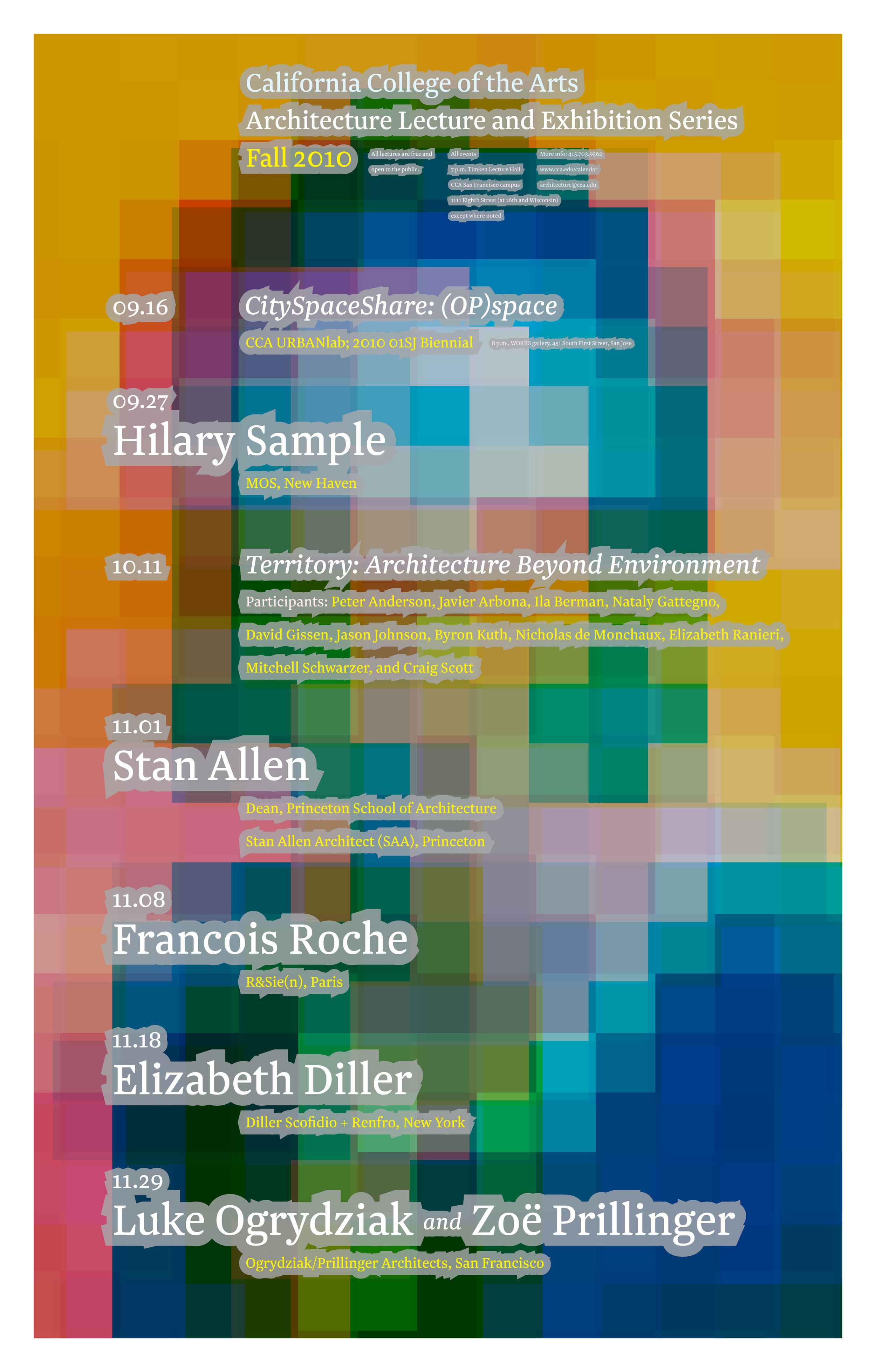

above: A photo of each speaker was transformed into large scale pixels and assigned a process color. These colors were layered to form composite portraits.